Short Answers to Your Big Questions about User Stories
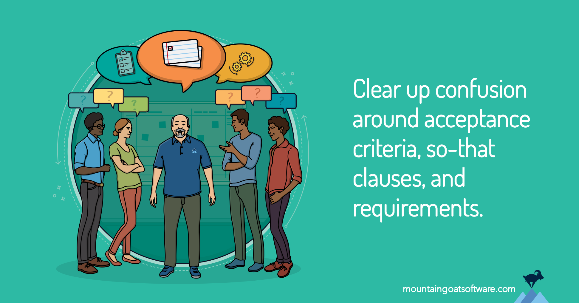
Is your team a bit confused about user stories? Get answers to common questions about acceptance criteria, so-that clauses, and user stories vs requirements.
Search the site:
Browse these topics:

No travel required. Train online at home and become a Certified ScrumMaster® or Certified Scrum Product Owner®. View here
Is your team a bit confused about user stories? Get answers to common questions about acceptance criteria, so-that clauses, and user stories vs requirements.
a.k.a. join more than 55,000 of our closest friends.


